Martin Grasser explains how he uses color as a tool and dives deeper into his 2 acclaimed projects from this year - Squares and LOVE
Generative & Systems Artist | Type Design

What a year it has been, especially for Martin Grasser. He first released a 196-piece long-form, generative art project on Art Blocks called Squares. Then to end the year, he released a highly dynamic collaboration with Art Blocks and the Association of Tennis Professionals (ATP) called LOVE.
I was able to get a glimpse into the mind of Martin as he dives deeper into both acclaimed projects, explains the importance of color as a tool, and much more.
At the end of our interview, Martin even hints at what he’s working on for the future and I can only imagine he’s learned a few new & exciting tricks from his experience this past year.
It’s been a wild year full of collecting great art and having even greater conversations with friends.
I’m proud to present my interview with Marty Grasser.
When did you first start creating art with code and experimenting with generative art?
I started around 2008. I was introduced to Processing and was immediately interested in the variation that it could produce.
Outside of generative art, what other type of art do you love to make?
Outside of computer algorithms, I still love to create art that is generative in some sense. The artwork is either produced by a system, or refers to some existing one.
I also love creating situations or tools that allow for a series of interactions between people.
For those that don’t know, it was you who created the official Twitter logo that is still being used today. I’ve been active since 2009 and have a special place in my heart for that bird logo.
I’m curious, Is there anything you would change today if you were asked to re-create it?
Nothing at all. I think it is the best simple and harmonious bird drawing there is. :)

I would absolutely agree.
Is this something you did in your free time?
No. Drawing birds for five months was a full-time job.
Since then, have you created any other notable logos for brands?
I have, although some unfortunately died in the corporate infrastructure.
Outside of logos, I’ve made a great commercial for Nike called “Choose Go” and have been able to work with one of my favorite photographers, Jake Chessum, a number of times over the years.
Hah! SO awesome, I remember this commercial.
Speaking of Twitter, what is the meaning behind the digital rose in your pfp?
No deep meaning. I was tracing some currency, and the flower was a part of a drawing. I really liked the way it was translated into such an abstracted form.
It seems that you enjoy experimenting with colors.
As an artist, what do colors mean to you when creating?
Color is an incredible tool for communication. How a color changes when it is put next to or surrounded by another color, how colors with high contrast start to blink, how a certain blue will remind someone of the Dodgers… I just find it endlessly fascinating.
Interacting with color might be my favorite part of creating art.
I was exploring the Abstract Type Generator and had so much fun with it, especially playing with the tools like hue, saturation, size, and more.

Did you create this as a personal interest or is/was this used in the real world somehow?

It was created out of personal interest, but meant to be shared. I find it exciting to give others the tools to reimagine what color and type could be, and to create their own artwork.
Omg, I downloaded your Color Dot Font pack and love it! Is this an extension/final product of the Type Generator app?
Color Dot font actually came first and reflects how, as a dyslexic person, I have always been more interested in the shape of a letter, a word, a sentence, a paragraph, or a page than in the meaning of words.
Type Generator is an extension of this interest. I love exploring the space between form (shape) and content (meaning)—even this paragraph is a drawing or painting to me.
Consider the left justified edge, the ragged right edge. Look at how beautiful this font is!!! The ascenders, descenders, point size, weight, and so on are artistic decisions that affect the form of the paragraph.
Now let’s set words in abstracted color fonts. Do their meanings change? No. But we have obscured the content in favor of form, and brought the text to life in another way.
This is something I want to keep working on.
On the other hand, Xerography explores monochrome colors; One black square placed on the photocopier, repeated, scaled, inverted, made into a pattern, and layered.
What interested you to work on this between 2008 through this year 2022?
Xerography is the project that started everything for me as an artist. It checked all the boxes of the things that I like.
I was able to create a visual language from a very simple starting point and outputs that could become complex yet remain recognizable; and I could use an ordinary machine to render it all.
There was also an element of chance. Different combinations of toner, paper type, paper placement, and number of runs through the machine produced unexpected moments of beauty that could be quite subtle.
And I have yet to exhaust all of the possibilities.
Your work explores systems and forms of repetition.
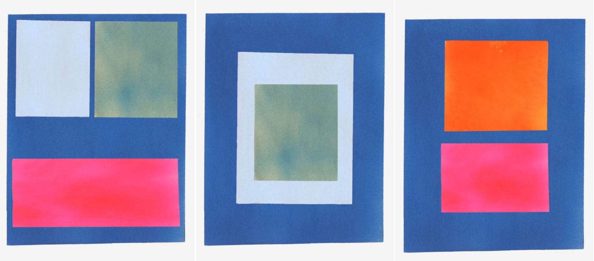
Which systems did you explore when creating your Art Blocks genesis, Squares?
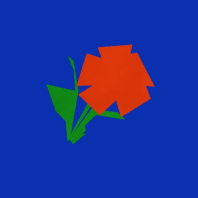
While Squares doesn’t explore a specific pre-existing system like Xerography does, it was inspired by the constraints of font design.
At the time, I was especially interested in how each letter of a monospace font must fill a fixed space. But instead of letterforms, I wanted to use a square, a simple repeatable form that could modulate from extremely small sizes to the size of the entire canvas.
By adding color and layering larger squares on a fixed grid, we were able to create depth, texture, and a balance between simple and complex forms.
In addition, can you give an example of the “forms of repetition” that you’ve used?
Repetition can be found in the way I work as well as in the visual forms I work with.
An example of the latter would be the single square in Xerography that is stretched, inverted, and patterned; and the same simple shape in Squares that is combined, scaled up and down, and layered.
To further discuss Squares, how did you end up falling down the rabbit hole of combining and overlapping squares at various sizes?

Did the project initially start out like how it was ultimately presented on Art Blocks for minting?
Not exactly. In 2015/2016, I had one blurry photo of color, which I started putting rectangles over.
These rectangles were cut out of paper, and as I layered different cutouts, the forms became more complex.
It was some time before the project became purely digital.
I think the project is absolutely beautiful, but why do you think so many people love it?
I think people like Squares because even though they are simple, they have nuance and detail.
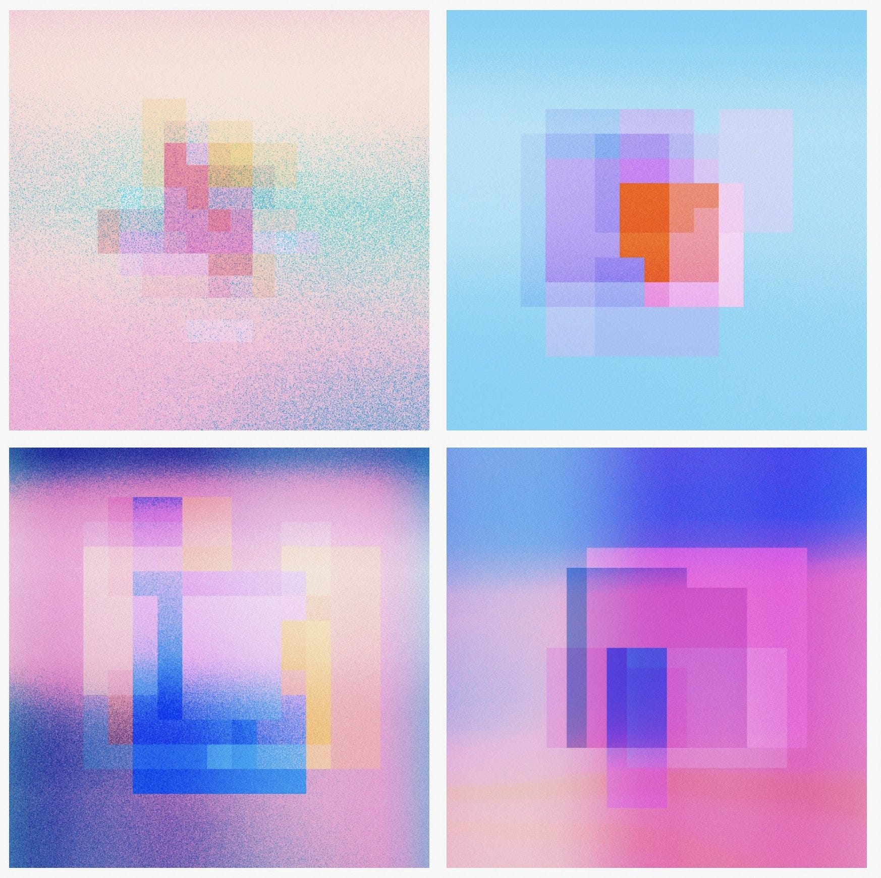
I’m curious, did ‘Spray Paintings’ inspire this project at all?
The nuances and textures found in Spray Paintings do show up in Squares, but the concepts behind the two projects are very different.
Spray Paintings is an exploration of what it is to paint. It is a simple translation.
How do flat digital colors translate into physical materials? And what is gained and what is lost in this translation?
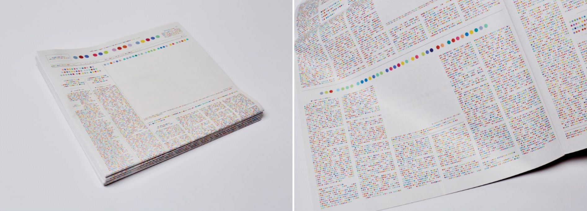
Regarding your project ‘Newspaper Forms’, what made you work on that during the years 2014-2022?
I was, and still am, interested in elevating the shapes that contain the news. They are abstract, beautiful shapes, but they are also meaningful and political.
By continuously erasing the news, I wanted to show how these shapes are as loud as the content they hold.

Recently, I’ve started thinking about these artworks as flags. For example, Fox News and CNN are both American news outlets. But the content they produce and their agendas are very different, and so are the shapes they use.
They fly different flags.
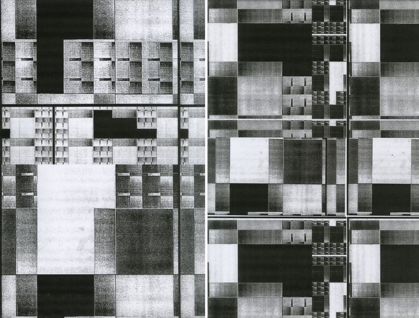
A more recent project ‘News Abstractions’ is currently in progress.
What is it about?
News Abstractions is an extension of Newspaper Forms.

In this project, I am using the graphic language developed in Newspaper Forms to explore the way news moves through so many channels in this endless 24-hour cycle.
News is chopped up and distributed over and over as it shifts from major news sources to social media.
For me, shredding and reconfiguring Newspaper Form’s graphic language is a reenactment of how news is created and disseminated.
I grew up playing tennis and am blown away by the outputs you’ve shared from your latest project LOVE - which is a collection of stunning generative digital artworks created in collaboration with Art Blocks Engine and ATP (Association of Tennis Professionals).
It’s bright, minimal, and includes actual tennis match data from the 2022 Nitto ATP Finals.

First, how did this unique opportunity come about, collaborating with the ATP?
The ATP had reached out to Art Blocks, hoping to create art that used the data collected during matches.
Art Blocks then put out an open call for the artists it works with. We submitted our proposal and very fortunately were picked.
This project seems super dynamic. “30 color palettes, 114 camera angles, and various zoom levels work in collaboration with the lines on the court and a bright yellow ball to create endless possibilities. The outputs serve as an artistic record of eight days of incredible tennis in competition.”
It might be a bit over my head, but I’m so interested in knowing, how did you integrate/utilize actual match data into beautiful art?
Match data was used firstly to determine which shots would be run through our algorithm. We wanted to capture the most impactful moments from the tournament, and the data allowed us to sort those extra special shots out from the rest.
From there we were mainly interested in the following three data points: shot velocity, direction, and location, that is, the precise location of where each shot lands. So in the artwork, speed and direction determine the size and placement of the shadow-like mark underneath each ball.

Location lets us map each shot onto a court, and naturally that placement influences how court elements show up in the final compositions.
art.tennis/collection does a great job of explaining the idea and what went into the algorithm briefly, but can you explain in your own words a little more in detail about this project and what it means to you?
For me, the most meaningful part of LOVE is that it’s a project that opens the door to people who don’t love art, or at least not as much as they love tennis.
Getting other people excited about art and thinking about the world in new ways is so fun because the net effect is more creativity!

Is the collection pre-determined or similar to Art Blocks, will it be completely random when minting?
The collection is predetermined in the sense that we curated 300 shots from categories like fastest serve, ace, match point, and of course championship point.
But these shots were minted in a completely random order.
Any special traits or features minters can look out for?
Absolutely!
Under Key Traits, you can find more unusual shots like the shot with the highest rpm backspin and the five fastest serves.
We also love how the features ground the art in reality—you know the player who hit your shot!
Other features like Match, Game, and Point shouldn’t be overlooked either.
We’ve had a lot of fun finding the exact shots in match replays by combining the information from these different features.
In the NFT space, it feels like years, but what are you most proud of accomplishing from this past year?
Publishing. And knowing when a project is done.
Anything you’ve been working on that you hope to release by the end of this year/or next year?
There’s SO much. I have a lot of work exploring text and abstract fonts.
I want to keep pushing the Squares algorithm. I’m fascinated by markets and their economics and hope to have something that plays with financial structures in 2023 or 2024.
I also have a collaboration around the elements of design that I am super excited about!
I can only imagine we will see more innovative ideas and dynamic projects released from you. Cheers 🥂 to a new year of fresh art!